Cross-Media Planner
Redesigning Arima's media planning tool so users move through a heavy, multi-step setup without friction.

Cross-Media Planner (CMP) helps marketers find the optimal media mix — deciding how to split a campaign budget across channels.
To run an analysis, users move through a long setup flow: configuring media channels, local markets, budgets, and advanced options.
Problem
The more you added, the harder it got to keep track.
Building a media plan meant entering a lot — each media channel came with its own settings like budget, so the more channels a user added, the more the inputs piled up. The existing flow made it easy to lose track — repeated clicks to move forward, little feedback along the way, and no easy way to tell what was still missing.
Design Process & Principles
With no user testing or analytics available, I walked through the existing product myself to find where it broke down. But finding problems wasn't enough — without data to lean on, I needed a clear standard for what "better" meant.
So I set two guiding principles:
[1]
Effortless input
Users should move through the setup without friction.
[2]
Effortless reading
Users should make sense of their results at a glance.
Every decision that followed traced back to these two principles.
Walked through the existing screens to map friction points and define the core problems.

Key Improvements
Build Campaign
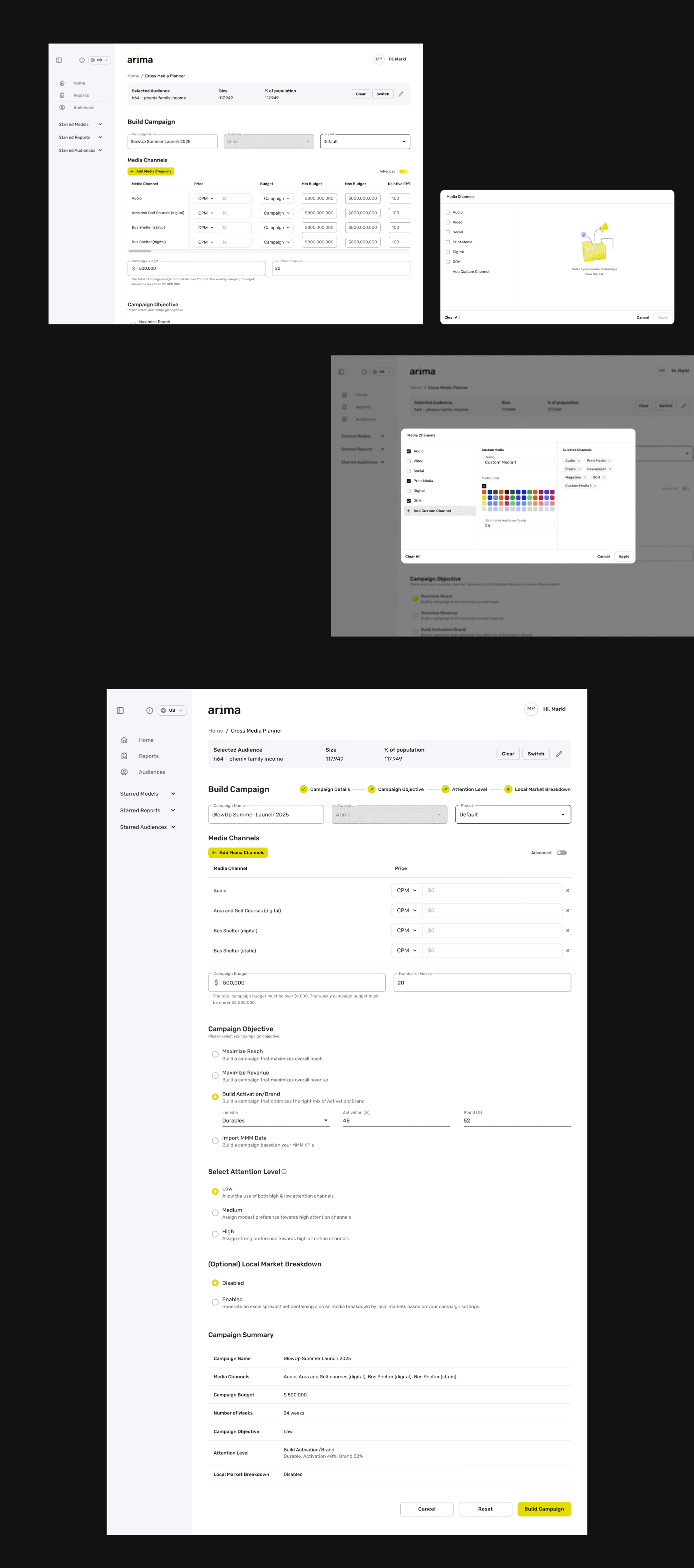
Entering campaign data involved many steps and options, so I focused on removing every point of friction across the flow.

[1]
Guide users through the steps

[2]
Keep the flow moving
Removed the per-section "Continue" buttons that broke the flow. Instead, a live summary at the bottom updates as users fill in each option — so they can confirm everything at a glance, no extra clicks needed.

[3]
Catch mistakes gently
The analyze button activates only when required fields are complete. If something's missing, the page scrolls straight to it and shows exactly what's left — so users never hit a dead end without knowing why.

[4]
Simplify heavy inputs
Replaced the channel dropdown with a modal that shows all options in one view, with selected channels listed for easy editing — so users no longer scroll endlessly through a long list.
Results
Once the analysis ran, users needed to read their results and act on them quickly. I restructured the page around clarity and exploration.

[1]
Get the essentials right
Some basics were simply missing — the results page didn't even have a title.
I gave it a clear name, repositioned the campaign-edit action, and brought the key follow-up actions — Save as report, Export to Excel — into clear view.
Small fixes, but they let users orient themselves and act on their results without hunting around.

[2]
Make data easier to explore
Switched curve comparison from a dropdown to tabs, so users can compare options side by side instead of clicking back and forth. Added inline table editing, so users can adjust budget and impressions right in the table without jumping to a separate screen.
Outcome
Delivered a redegined flow built to cut repetitive clicks, surface clear feedback at each step, and make a heavy input process feel manageable — all within Arima's exiting design language. The direction was well received by the internal team.

Looking back
Designing without research or data felt uncertain at first — but setting clear principles early gave every decision a consistent anchor. Since the redesign rolled out after my time at Arima, I never saw it validated with real users; if I could revisit it, I'd want to test those principles against actual usage and see where they held up.